Saying a proposed sign for a pharmacy moving into a vacant Main Street space is too big and loud, planning officials on Tuesday called for a new design.
A rendering of the proposal for the front of the Greenwich Pharmacy at 118 Main St. showed a plain red-lettered sign that would “read as a huge billboard,” Planning & Zoning Commission member Kent Turner said at the group’s regular meeting, held in the Town Meeting Room.
“This sign really goes from one side of the building to another,” Turner said of the proposal. “This sign is 38 feet long. It is absurd.”
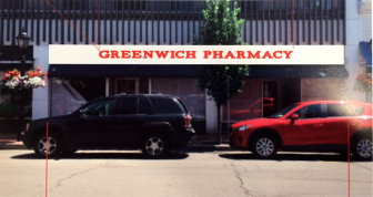
P&Z officials say this proposed sign for a new business to open on Main Street is not right for the location.
Zoning regulations (see page 118 here) call for rectangular signs no more than 20 inches high and no more than 15 feet across, with maximum 12-inch-high letters.
Commissioner Elizabeth DeLuca, head of a P&Z committee that deals with signage in New Canaan, told the applicant for the sign at Greenwich Pharmacy—Adam Cohen of Danbury-based Sign-A-Rama—that the sign as proposed was too large, that red was not a viable color, that reverse lighting was not permissible and that wood was far preferable to the shinier caste aluminum that he had planned.
“That is a very prominent location, so we would like to see something a little bit more elegant,” DeLuca said.
Greenwich Pharmacy will open on Main near the intersection with Elm Street, in the space formerly occupied by the Silk Purse consignment shop.
Cohen agreed to re-submit a design to the Town Planner for review.
Commissioner John Flinn encouraged Cohen to consider more muted colors, such as blue or green.
“Those are traditional medical colors,” Flinn said. “And I don’t think we need to—everybody is going to know that the pharmacy is there. It’s a huge location. Big, big, big spot. Everybody is going to know that it’s there, so we don’t have to have a sign that glares and blasts this out to everyone.”
DeLuca said that if Cohen wanted to propose a version of red, that it would need to be at least as dark as the red in Pinocchio Pizza’s sign across the street.
She also referred Cohen to the “Town of New Canaan Village District Design Guidelines,” a document which includes this note on sign design: “The shape of the sign shall complement the architectural features on the building. Simple geometric shapes are preferred for all signage. Signs shall be trimmed and detailed to complement the building design features. In addition, all new signs shall achieve a level of visual compatibility with existing signs that comply with these design guidelines.”
Noting that the very bright white on Cohen’s proposed sign “jumped off of” the building itself, commissioners also asked the sign-maker to find a more muted, “off-white” background color in his redesign.
You said sign on Elm !!!!
Thanks Marvin, fixed that street address.
Doesn’t anyone point out to the sign designer that there are regulations, in general, and further regs in the Village District?
Mimi as I recall the designer in this case had misread the regulations. There’s a rule saying that all signage on a storefront must total 25 square feet or less. He took it to mean he could have 12″ letters on a sign 25 feet across. In fact, as the head of the P&Z Sign Committee pointed out to him, the big rectangular sign out front cannot be more than 15′ across.